I created this image in Photoshop by laying a picture of my
face over this picture of a tiger. Then I lowered the opacity and lined up my
eyes and mouth to the tiger’s. Afterwards, I erased everything on my face but
my eyes and mouth, and changed the opacity back to 100%. One problem that I ran
into was that my eyes and mouth were and odd shade of purple, because the
picture of me was taking in poor lighting. After searching around for what to
do, I remembered to click auto tone, auto contrast, and auto color, and ended
with what you see above. My favorite part of creating this image was erasing the rest of my face. Before I did this, the pictures looked like a disaster waiting to happen, but afterwards, I began to see what the final image was actually going to look like.
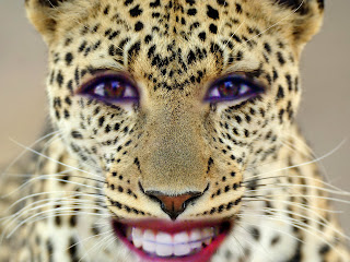
Similar to the picture above, I created this image using two
pictures and Photoshop. I erased everything but my eyes and mouth, but the
coloring was still a bit off. Like before, I clicked auto tone, auto contrast,
and auto color, to correct the coloring of the image. My favorite part of
making this particular picture was stretching out my face to fit the leopard’s
face. Although it took a bit of extra time, it was worth it in the end.
I constructed this photo above by laying a photo of a red
panda on top of my face. With a little bit of Photoshop magic, I was able to
fit our faces together, and try and blend them together. My favorite and most
difficult part of this project was trying to make it look “natural”. Although
having half the face of a red panda will never look totally natural, I was able
to lower the opacity of my eraser, so that some fur still showed through on
both halves of my face.
This photo above was made the same way as the third photo. I
laid an image of a tiger on top of my face, created a mask, and blended our
faces together. The most challenging part of this project was lining up the
tiger’s face with my own. The tiger has more scrunched up features, while mine
are spread apart. This meant that I had to stretch the tiger’s face to fit
mine, while trying to keep it looking natural. Similar to the photo before, my
favorite part of creating this image was blending my face and the tiger’s face.
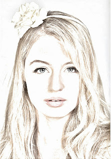
In this Photoshop tutorial, I learned how to take a normal
picture, and transform it so it looks like a sketch. The final product is shown
above. This tutorial had many steps, but they were all simple. To achieve the
look above, I created many layers, changed their adjustments, changed the blend
modes, applied filters, and moved around the layers. This tutorial was simple
and easy to follow; therefore I didn’t run into any problems. My favorite part
of creating this image was seeing the final product. Up until the last step, the
photo did not look like it would turn out, but afterwards, it all came together
and formed what you see above.
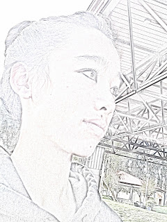
This photo was created the same way as the one before. The
hardest part of this project was trying not to make the photo too washed out. Eventually,
I adjusted the opacity of the layers, and was able to get the colors to pop
more than they previously were. My favorite part of creating this particular image
was inverting the image. It looked like the image was glowing from inside,
which is an effect that I am not used to seeing.
The image above was created similarly to the two images
before. This image was simple to Photoshop, so there was not a “hardest part”
of the process. Similar the first sketch image (image 5), the best part of
making the image was seeing the final product.
I created this image by adding a gradient map as well as an overlaying
texture to the image. The hardest part of creating the image was figuring out
where the gradient map was, but with some help, I was able to continue on with
the project. My favorite part of creating this image was adding the texture on
top of the image. That step finalized the image, and made it look even more “vintage.”
This photo was created the same way as the portrait of the blonde
girl above. The hardest part of the project was trying to get the lighting
correct. The original lighting of the picture was very dark, so I had to
brighten the picture before starting the tutorial. Similar to the image above,
the best part of creating it was adding an overlaying texture.
I completed the image above using the same steps as the two
images before. The hardest part of the project was trying to find a texture
that would fit the size of the image. Luckily, I changed the search options,
and was able to find a texture off of Google images. The best part of creating
this image was lightening the picture. After it was lightened, I was able to
see the bright red of the flowers against the muted green color of the background.


